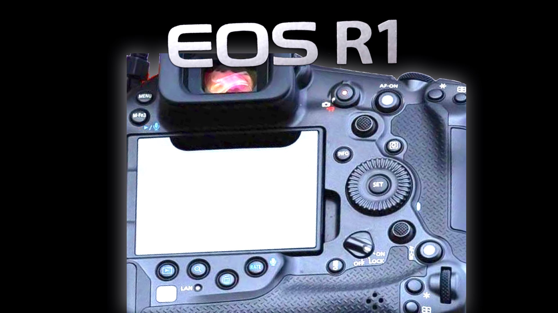
Design = Functionally. Hence, the anticipated Canon R1 will be an upgraded version of the EOS R3. The leaked image of the R1 shows very high similarity (almost identically) to the R3. Check it out.
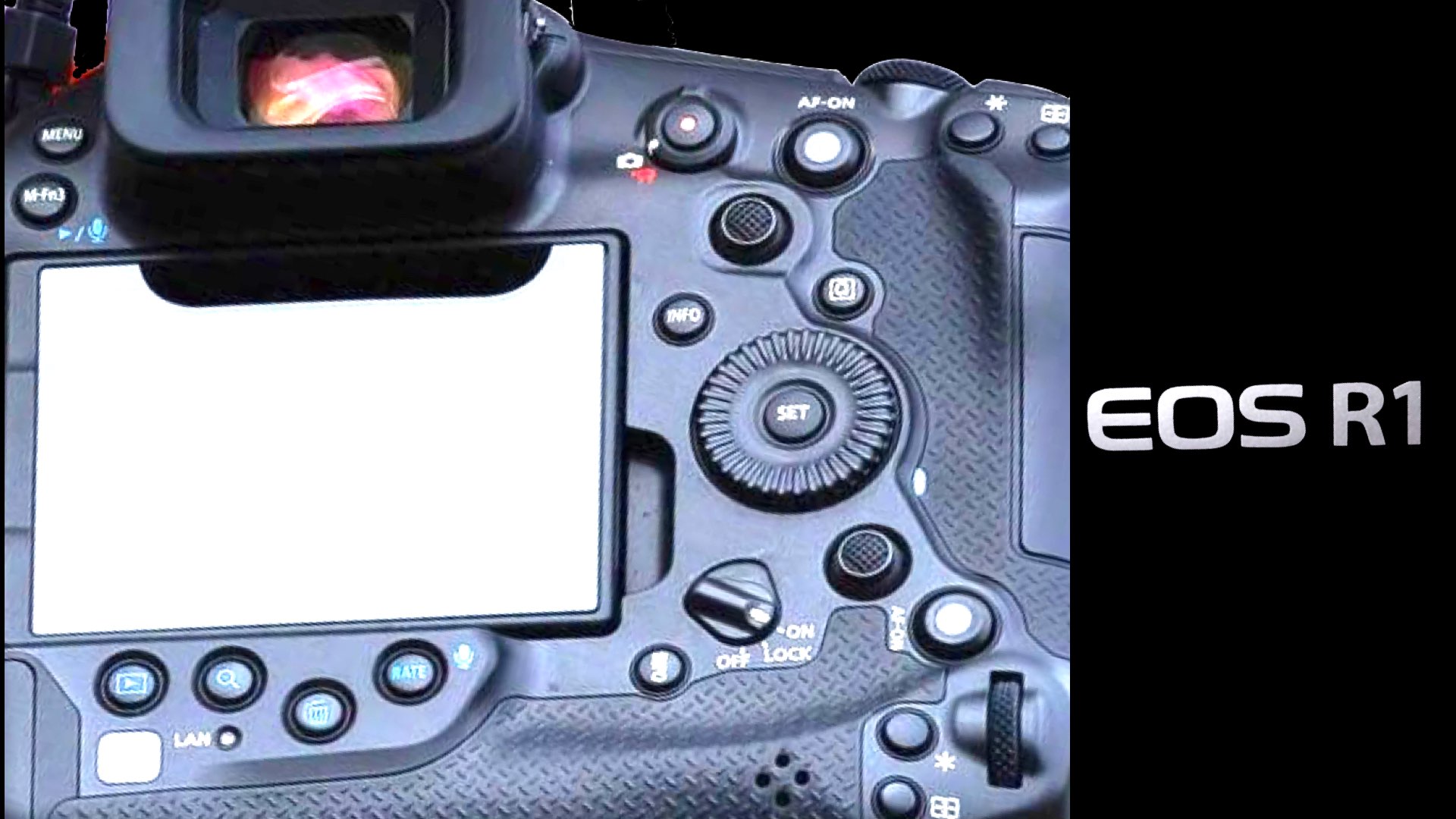
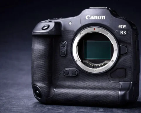
Canon EOS R1=EOS R3
A few hours ago, Canon published another teaser on its IG page, presenting the forthcoming Canon EOS R1 as “This is the 1 you’ve been waiting for!”. However, no camera pictures were released besides a few high-resolution ESO R1 images published on Canon Asia. No specs were released as well, and Canon keeps all the cards close to its chest. Understandably! As for the front of the camera, it looks almost identical to the R3, button by button. But what about the back of the camera? Luckily, a picture of the EOS R1’s back was leaked, exposing an interface almost identical to the EOS R3. Check out the comparison between them in the slides below:
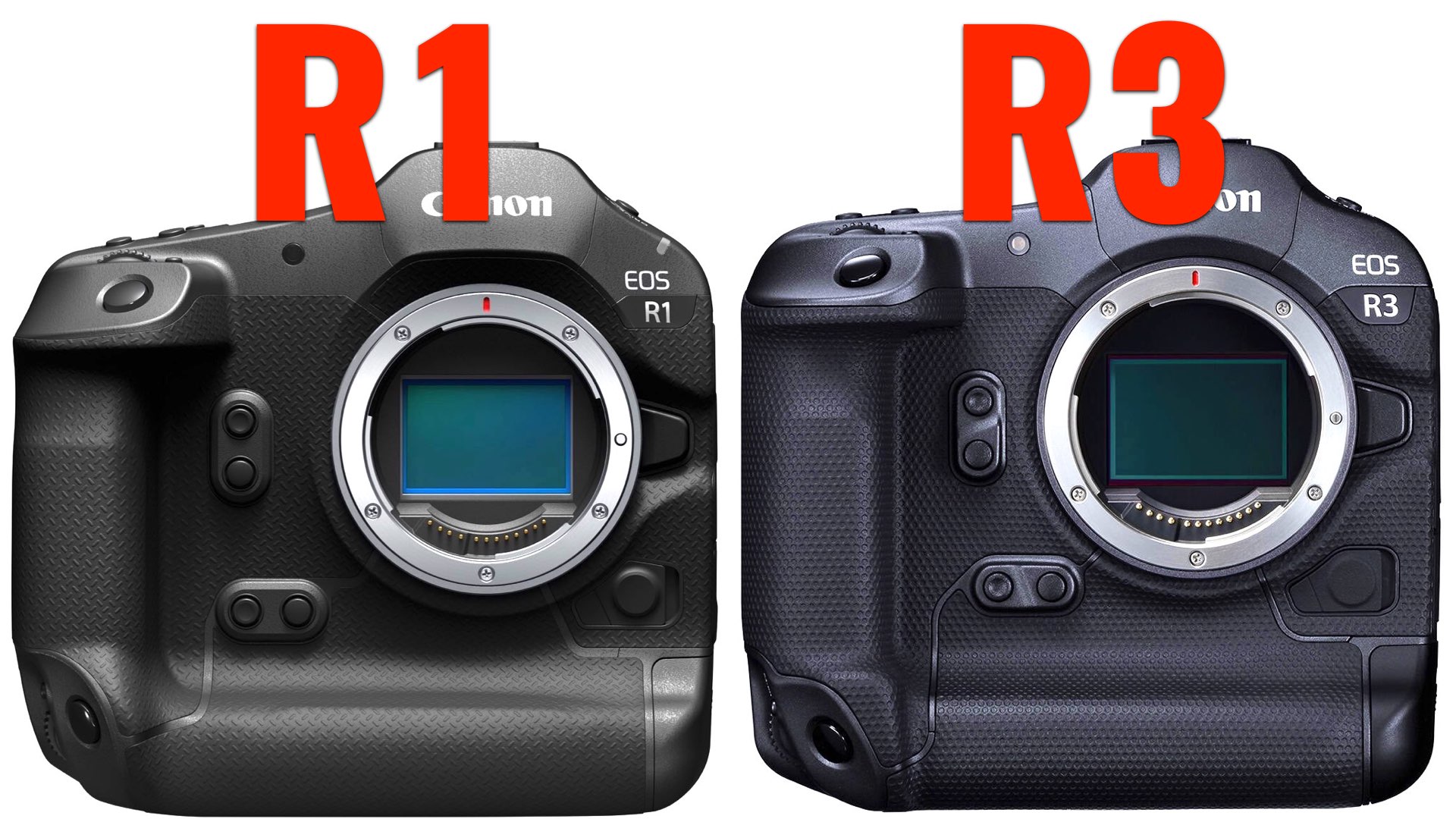
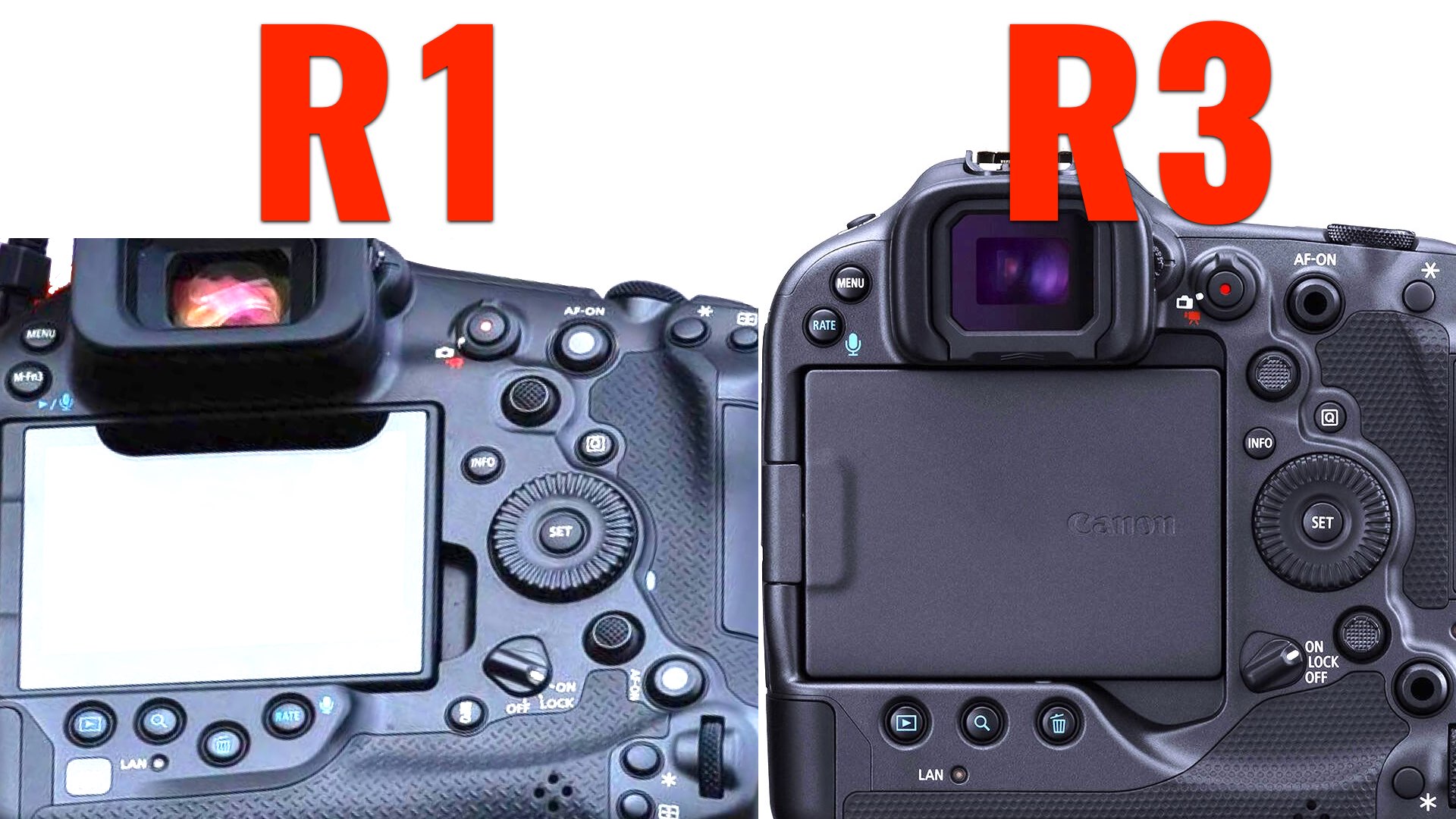
Canon doesn’t change the design
Canon cameras are built like a tanks, characterized by a massive, beautiful, and accurate design. Canon is right. Do not change a winning horse! However, it’s starting to become a bit boring. Take RED for example. The intriguing unconventional design was an integral part of RED’s success. Canon on the other hand, keeps it strong, practical, and simple. Nevertheless, the design of the R1, which is the next flagship, is almost 100% similar to the R3. This makes things a bit less exciting. Furthermore, every product designer will tell you that design = functionality. Thus, the R1 can be defined as an upgraded model of the R3. And this might be Canon’s goal, just to make a better R3. That’s fine! However, you should not expect an all-mighty flagship, or should you?

