Knowing color theory is mandatory, especially in the digital cinema age. This article demonstrates color theory at a glance so you can get inspired by how colors can help deliver the pathway of your story.
The power of colors in filmmaking
No, this is not an article regarding color grading. The goal here is not to transform you into a colorist nor a DaVinci Resolve specialist. Although this article aims to junior filmmakers and beginners, I am sure it will be beneficial to every content creator.
We are experiencing the digital cinema age, which means we are surrounded by affordable cinema cameras that deliver sophisticated codecs and output. Therefore, it is essential to recognize some fundamental methodologies regarding colors. Nowadays, almost every camera manufacturer is allowing us to grade their footage. RAW is not rare anymore, but a ubiquitous codec. The Log-X alternatives are also very robust in terms of colorability in post, which means you can take almost any footage and manipulate its colors.
Furthermore, the available tools are powerful, and some of them are free (DaVinci Resolve). However, the challenge is to manipulate colors the right way, and according to the story. The manipulation of color is supposed to serve your story and enhance the audience’s experience by making it more immersive.
We are experiencing the digital cinema age, which means we are surrounded by affordable cinema cameras that deliver sophisticated codecs and output. Therefore, it is essential to recognize some fundamental methodologies regarding colors
Color Wheel as a powerful tool to tell a story
It all began in 1666 when Isaac Newton invented the color wheel. The color wheel (or circle) contains the mapping of the color spectrum, in a circled structure. The color wheel shows the relationship between colors and thus represents the basis of color theory. This very same color circle is being used in almost every NLE (Non-Linear Editor) as well as grading software.
In simple words, the color wheel is an abstract illustrative organization of color hues around a circle. The color circle facilitates the creation of the look and feel and help filmmakers and colorists to create harmony based on combinations between different colors.
Hue, Saturation and Luminance creation inside the Color Wheel
A hue is any color on the Color Wheel. Saturation is defined as the intensity of the color, and luminance is the amount of brightness in color. When you are using the Color Wheel, you have the privilege of picking and adjusting the saturation and luminance of a hue.
Color equals mood. For instance, instinctively, when we look at the color Red, we think about power, danger, and aggression. That’s because Red reminds our blood
Colors combinations
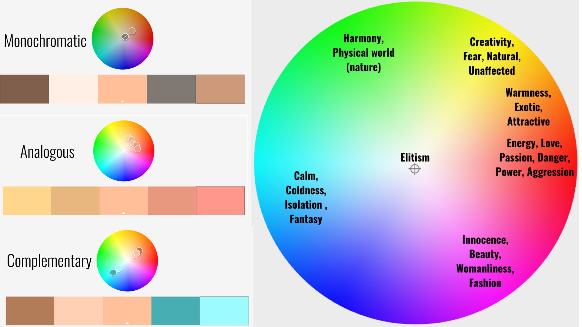
By understanding the structure of the Color Wheel, you can achieve various types of combinations. Each combination indicates a different kind of mood and harmony, which means it can affect the audience differently. Have a look at the most common combinations:
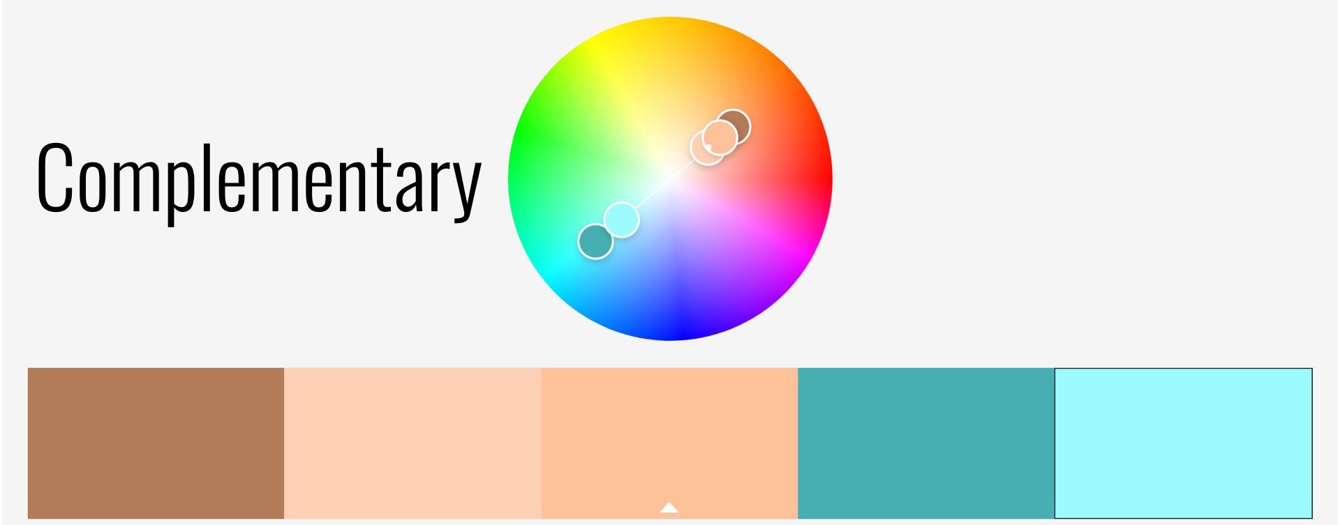
Complementary colors
Complementary colors (or look) are made by colors that are on opposite sides of the Color Wheel. This combination provides high contrast and high impact color combination that will lead to a brighter and more prominent look.
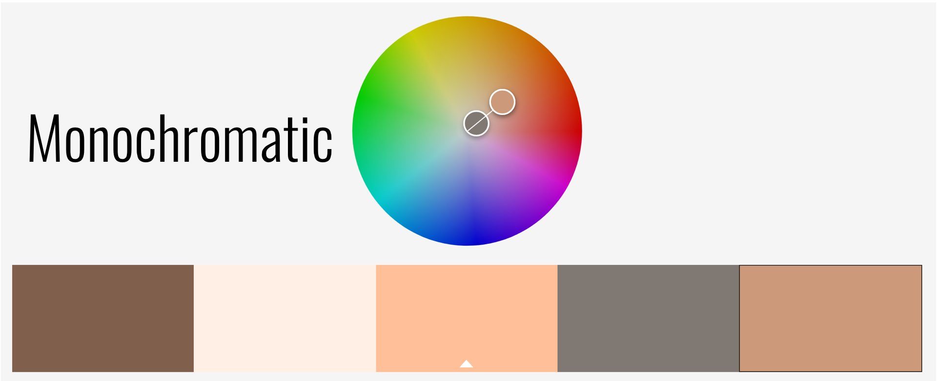
Monochromatic colors
Three shades, tones, and tints of one base color. This combination provides a subtle, harmonic, and conservative look.
Analogous colors
Analogous are several colors that are located side by side on the color wheel. This color combination can be versatile and depends on the dominant color.
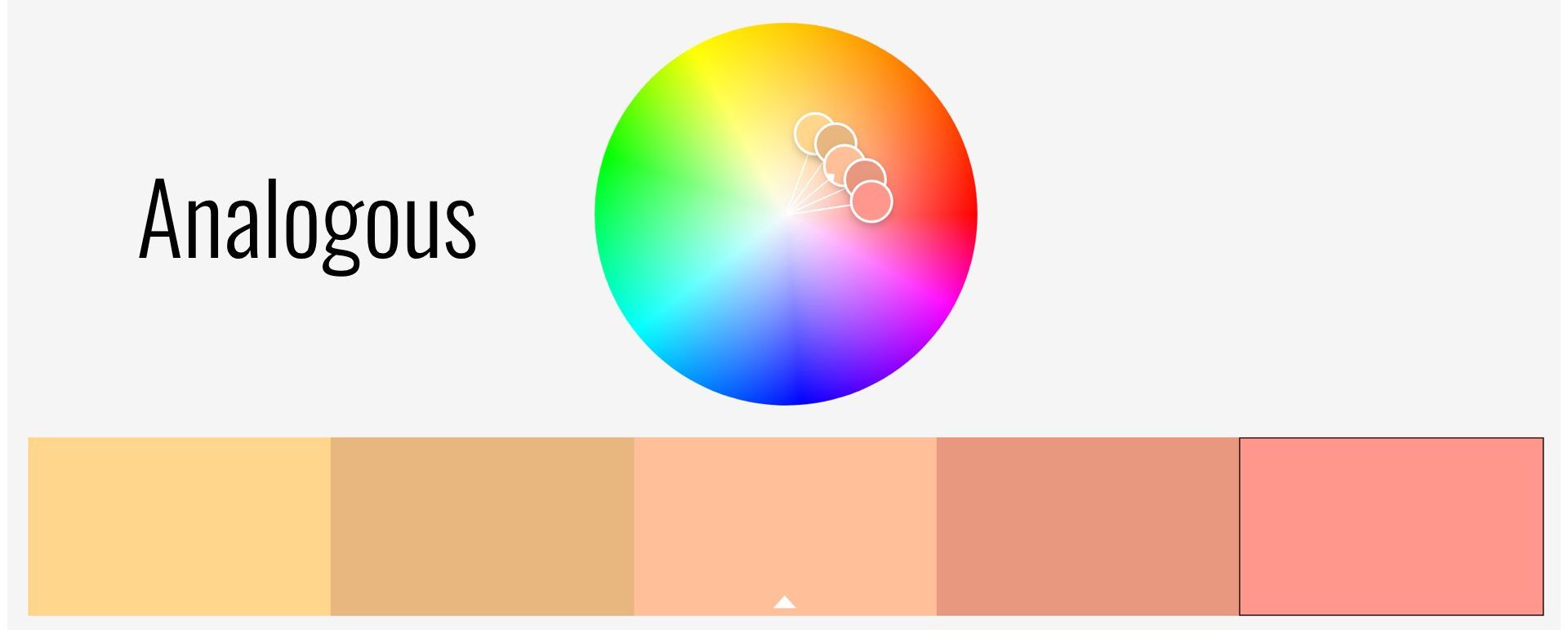
There is a cool online free tool created by ADOBE so you can examine and try in real-time the combinations above.
The Color Wheel as a psychological tool
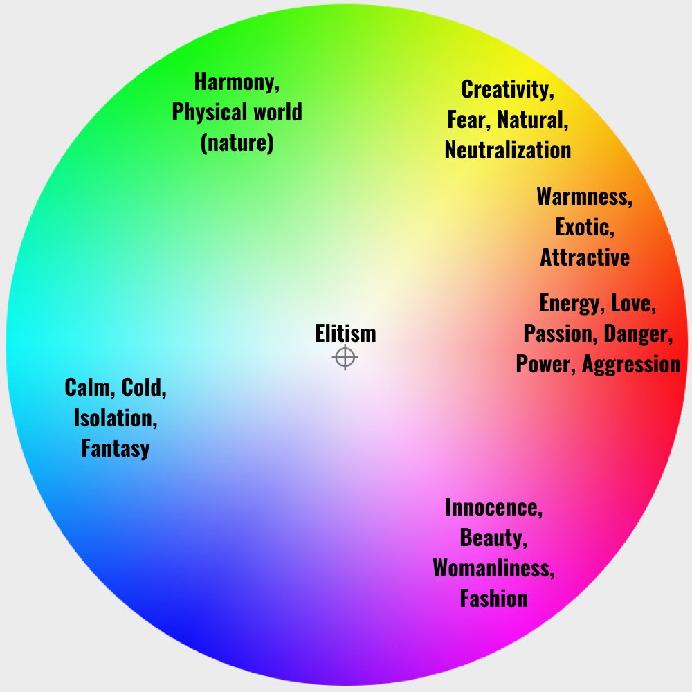
Color equals mood. For instance, instinctively, when we look at the color Red, we think about power, danger, and aggression. That’s because Red reminds our blood. On the other hand, the color Blue creates connotation of relaxation and isolation (blue skies). Have a look at the scheme below to explore the psychology hidden inside the Color Wheel.
Color diversity in digital cinema
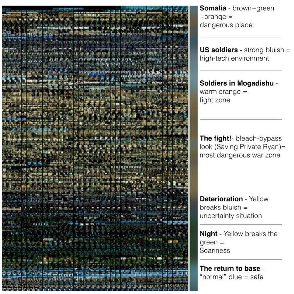
A film can be composed of multiple color combinations that lead to various psychological impacts on the audience. In many cases, there is one dominant look (color combination). However, there will be a diversity derived from the complexity of the story’s development.
As an epilogue, let’s take a look at this beautiful frame-by-frame image below, which shows the changing color palette in Ridley Scott’s movie Black Hawk Down.
Click on the image to get a larger and more detailed view.
What is your favorite color combination? Have you tried some of these color theories? We’d love to hear your insights below.

