Avid’s most famous software has undergone a new redesign to more polished modern NLE look. The Media Composer now owns an improved GUI (Graphical User Interface), more customization options and preferred workflow. What are the reasons behind that? Is that a renovation of the Media Composer or just a refurbishment?
The battle of the NLEs
Avid needed some changes. Being the preferred NLE (Non-Linear Editor) for Hollywood features is OK, but not enough since the Hollywood is just 3% from the whole market-share filmmaking industry. That is even harder when you have some decent and tough competitors like FCPX, Premiere and even Blackmagic DaVinci Resolve which is going to announce a significant improvement regarding the editing capabilities of Resolve (will be announced today-stay tuned!).

Final Cut X has started the NLE race
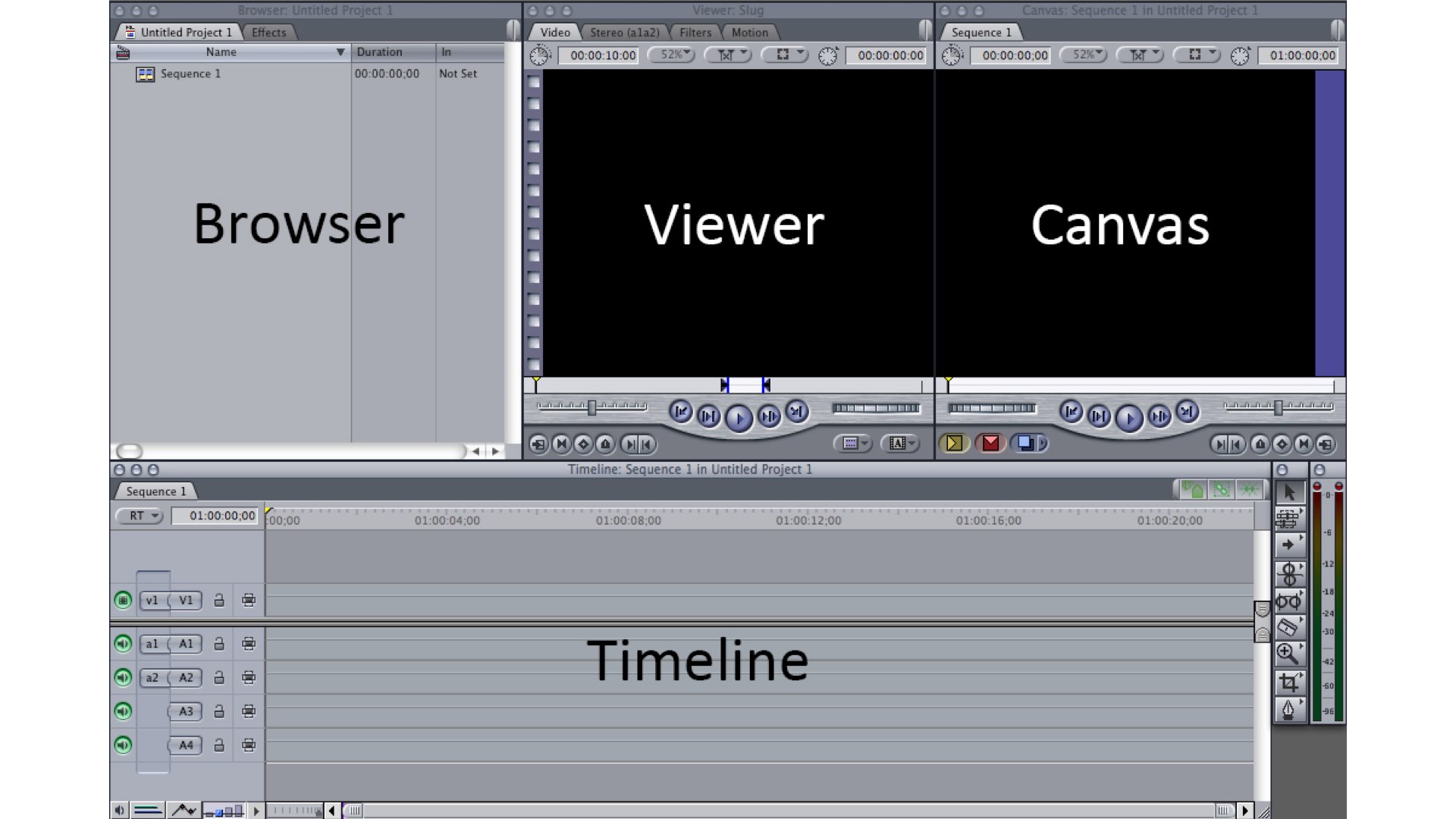
Although there are a lot of haters out there, the shift from FCP 7 to FCPX was a brave business move by Apple. Presenting a whole new black interface with strange UI (magnetic timeline) that was called the NLE for amateurs or iMovie on steroids, has proved itself to be a genius step. That was a kind of revolution regarding editing approach and methodology. It took some time for Adobe to adapt its Premiere Pro to those changes. Nowadays, Premiere Pro looks more like FCPX and the UI gaps are being reduced on every PP new update.
Presenting a whole new black interface with strange UI (magnetic timeline) that was called the NLE for amateurs or iMovie on steroids, has proved itself to be a genius step
The conservative Avid
Avid from the other hand, was aiming to be traditional and outdated. We are not using the word obsolete here, because Avid worked well and still works. However, Avid was failed to attract new filmmakers and editors. The seniors love it because they are used to it. Hollywood knows Avid and most of the post platforms and ecosystems are Avid- dedicated. Nevertheless, Avid needed a change, and the NAB Show is the place to present it.
So, what’s changed?
As stated by Avid: “The new Media Composer. Completely reimagined for what you need today and tomorrow while maintaining everything you know and love about the Emmy®, Oscar®, and ACE Eddie award-winning tool that started it all”. Let’s soar over the changes:
For production teams
Fully customized toolset: simplifying collaboration functions, which also means an improvement in media management (Final Cut style), thus more visual interface.
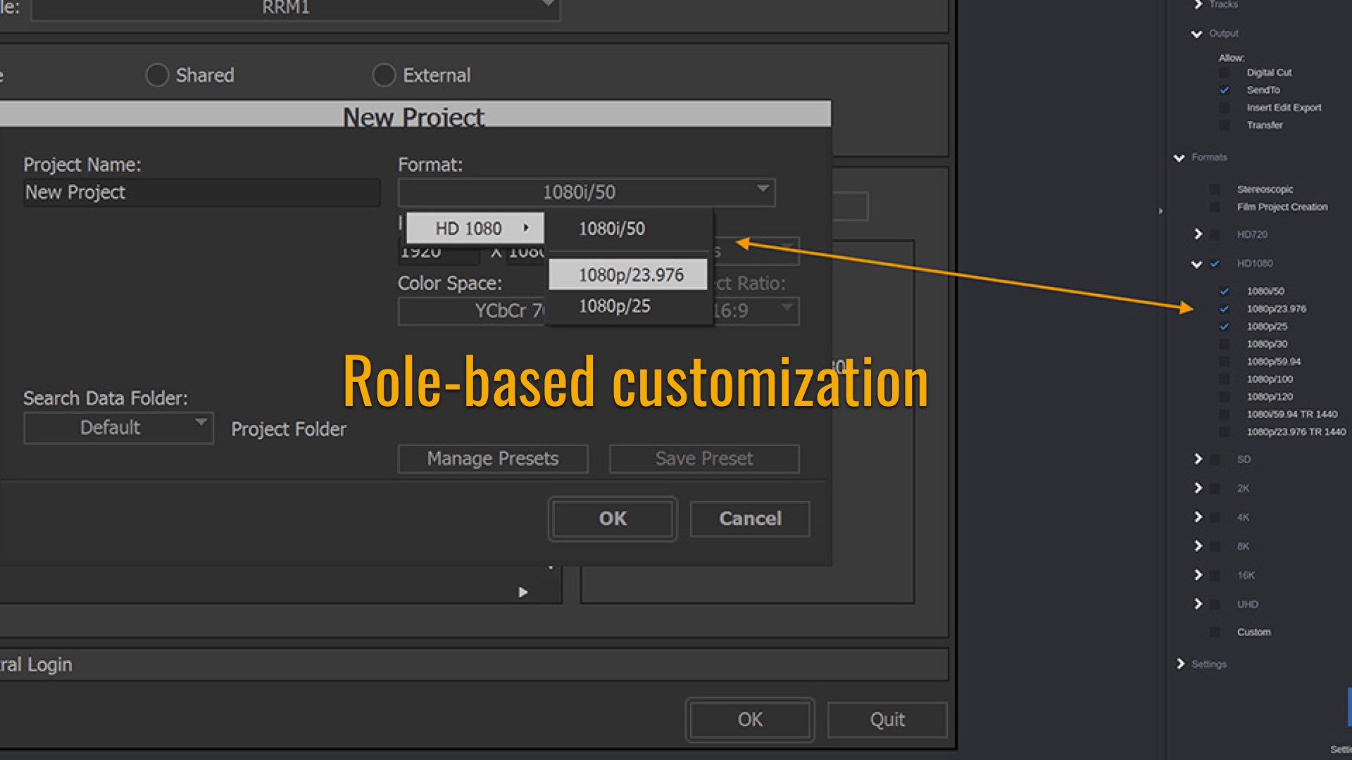
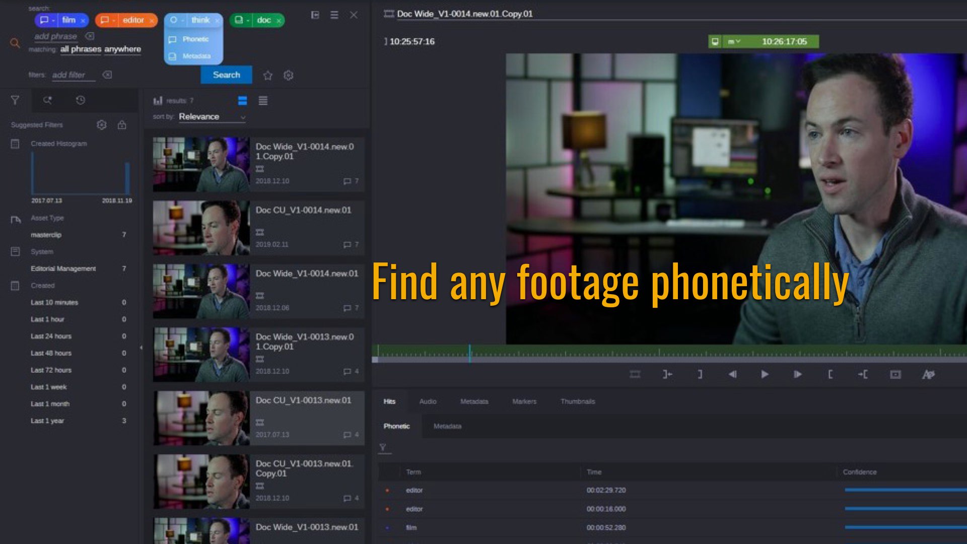
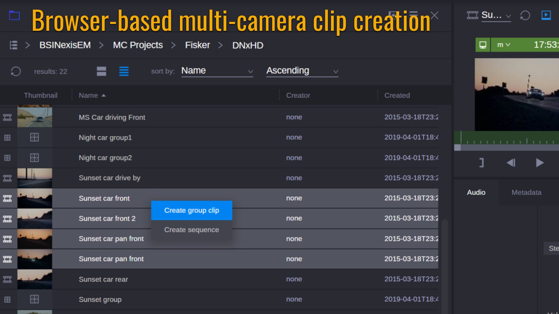
Edit: intuitive interface and enhanced user experience.
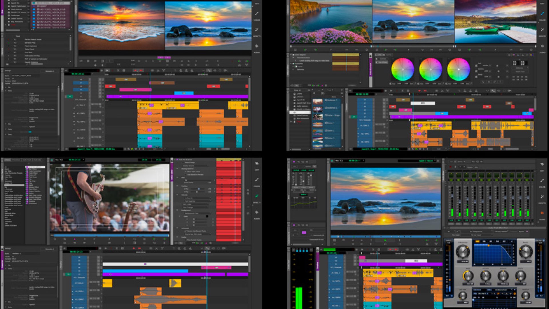
Finish and delivery: Maximize finishing capabilities focusing on more efficient flow, including the option to export in 16K resolution.
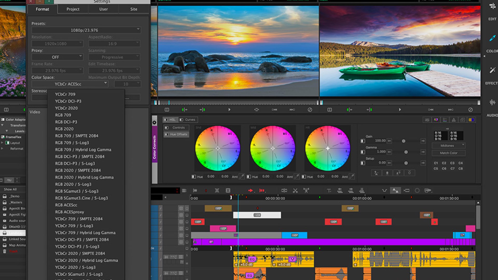
For individuals
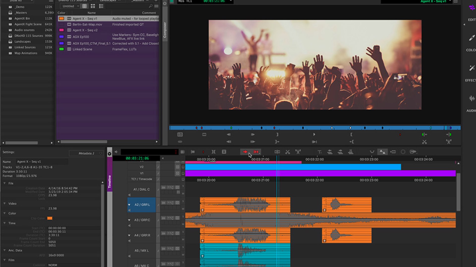
Again, improved interface. Avid claims that you can “Edit at the speed of imagination” thanks to a much more intuitive interface and an enhanced user experience.
Final thoughts
One of the weaknesses of Avid was the lack of simplicity and intuitiveness. The steep learning curve and the interface’s complexity were severe obstacles. Now the GUI looks more promising, but should it be enough to attract new users? Time will tell. Meanwhile, let’s wait to DaVinci Resolve 16 (going to be announced in a couple of hours here at NAB).
What do you think about the refurbishment of Avid Media Composer? Is it too late? Comment below!

